- Role
- Senior UX Designer · Product Owner of the design system
- Team
- 5 designers (2 UX, 3 UI), front-end team, product managers, data analysts, customer support
- Timeline
- Dec 2022 → Jul 2025 at Knauf Digital · navigation sprint Oct 2023 · relaunch Mar 2024
- Tools
- Figma · MUI 5.11 · Storybook · Contentful · Adobe Analytics
- Links
- knauf.com
TL;DR
Knauf is a 100-year-old building-materials company whose website had to serve DIY customers, planners, distributors and applicators at once — through five levels of navigation, early-2000s branding and 12 regional sites that shared no design framework. As one of two UX designers I led the discovery, testing and prototyping of a new global navigation; in parallel I volunteered as Product Owner for the design system, consolidating four systems and 50+ files into one MUI-based library that designers and developers now share. The relaunched knauf.com went live in March 2024.
What shipped
The work, before the story
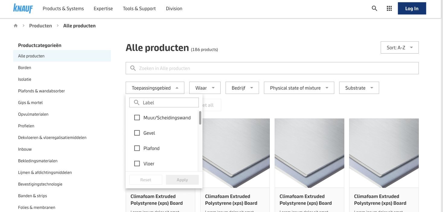
Products in three clicks, not five
A flat catalogue with faceted filters and a breadcrumb replaced the 5-level tree. Product pages are where nearly half of all visitors want to land.

One navigation for four customer types
Three pillars — Products & Systems, Tools & Support, Brands — with a mega-menu and a breadcrumb, chosen by 80% of test users and shipped to every region.
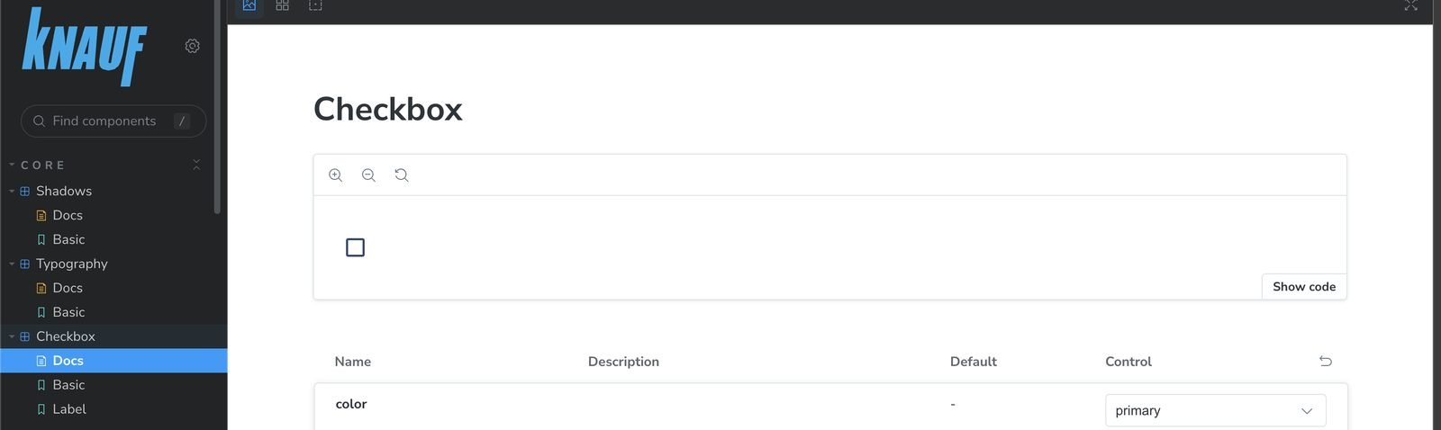
A Storybook that matches the Figma file
The new library lives in code as well as in design, so “why does it look different from the mock?” stopped being a daily question.
Context & problem
A global site that had grown one region at a time
The legacy knauf.com was hard to navigate, hard to read and impossible to keep consistent.
Knauf.com had accumulated content for two decades. Branding varied from page to page and still reflected an early-2000s visual style; the site was not mobile-friendly; images and videos were low quality; overlapping pop-ups caused accessibility problems; and every region had built its own variant with no shared framework.
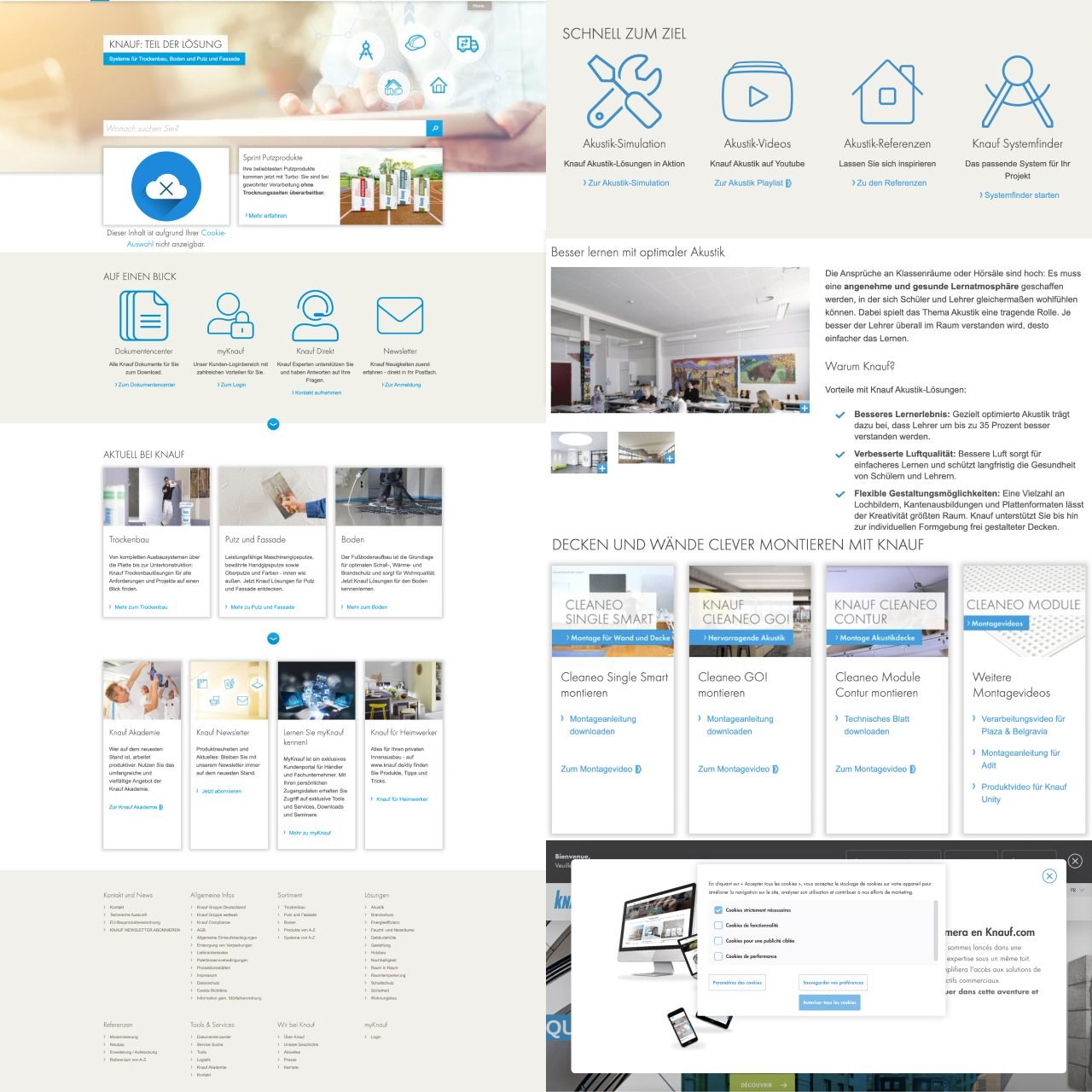
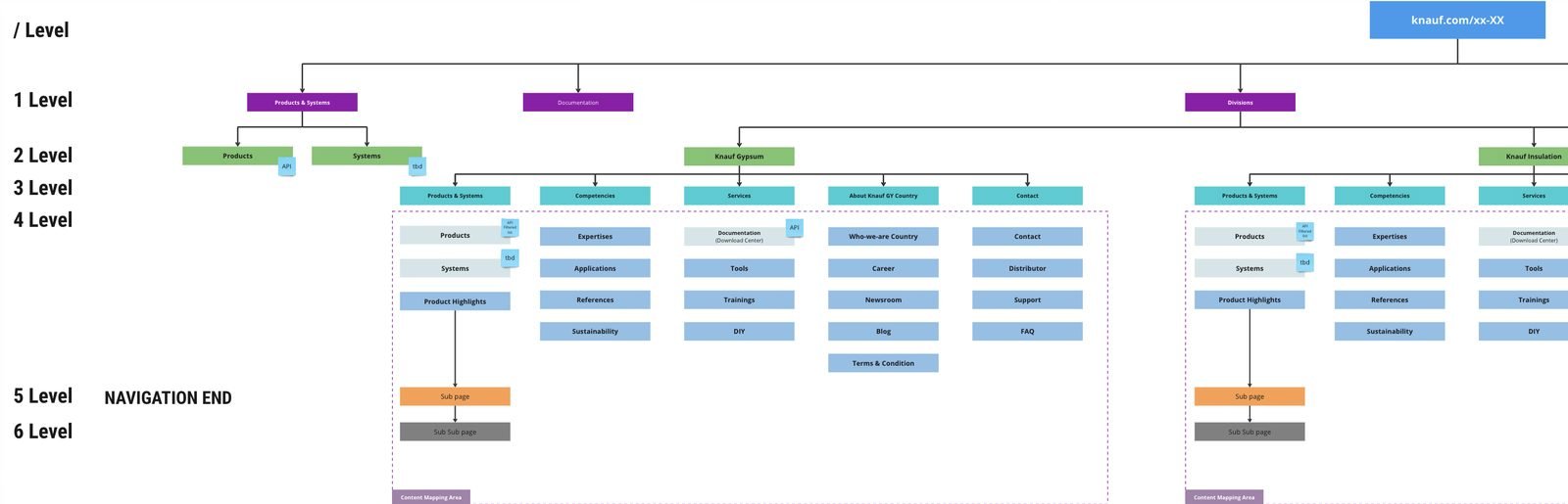
The most expensive problem was structural. At a glance we were showing visitors five levels of navigation (six in some regions). Users lost their place, could not get back to the level they came from, and dropped out. It was a global issue across every regional site.
Research
Who visits, what they look for, and where they get lost
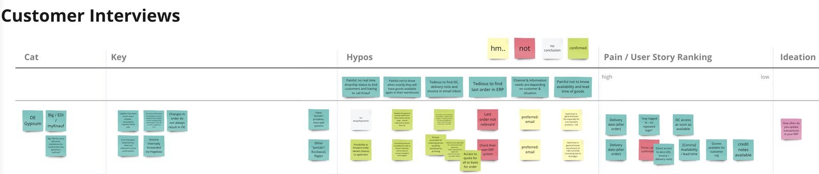
Before touching a screen, the design team ran discovery kick-offs to inventory every content type on the site and categorise it. Then we sat down with customer support to learn what each customer group — DIY, planner, distributor, applicator — actually comes to the website to do, and with the data team to see where traffic comes from and where it converts.
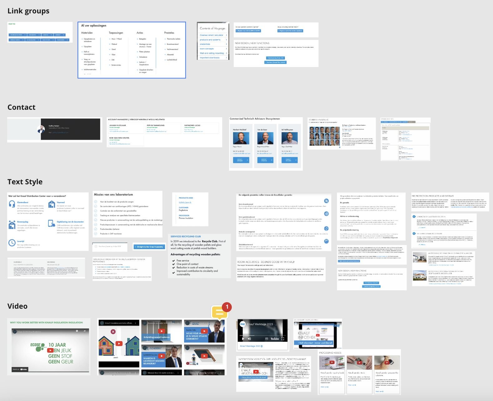
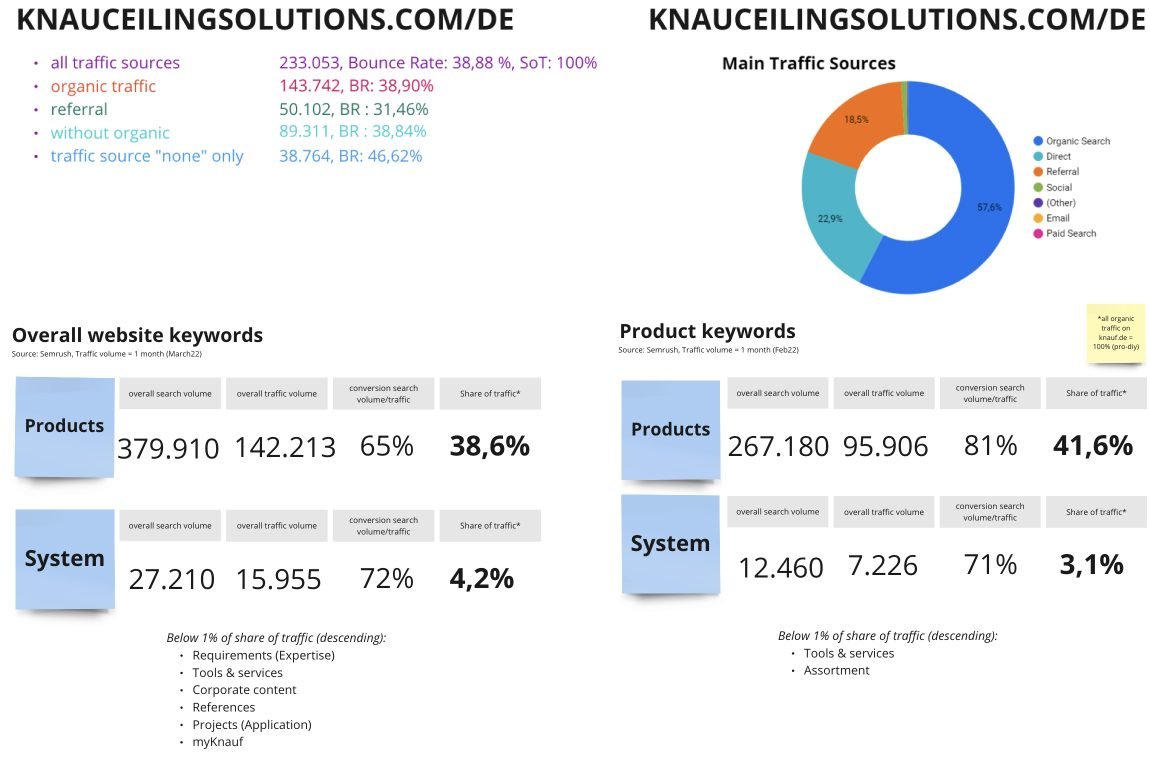
Two findings set the direction. Nearly half of all visitors arrive looking for a product to use, study or buy — yet it took five pages to reach a product landing page. And the four customer groups have almost nothing in common in what they need first. So the primary task for the first design sprint became: get each customer type to their focused part of the site faster.
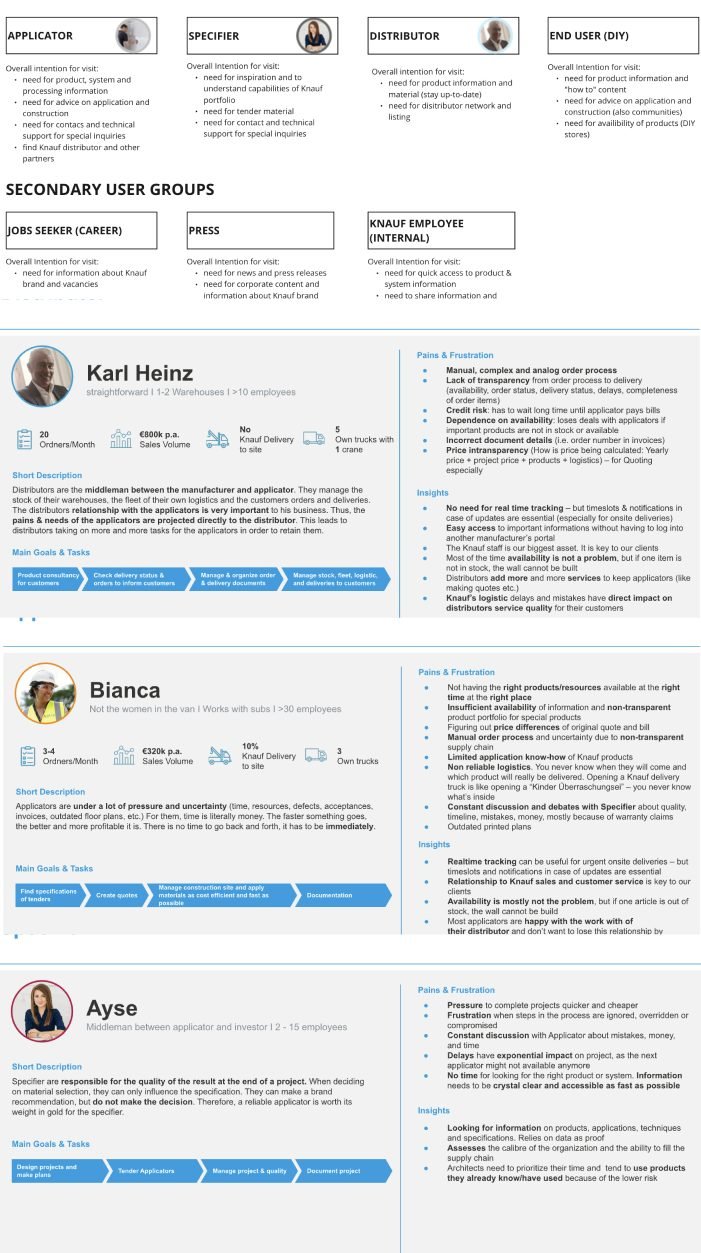
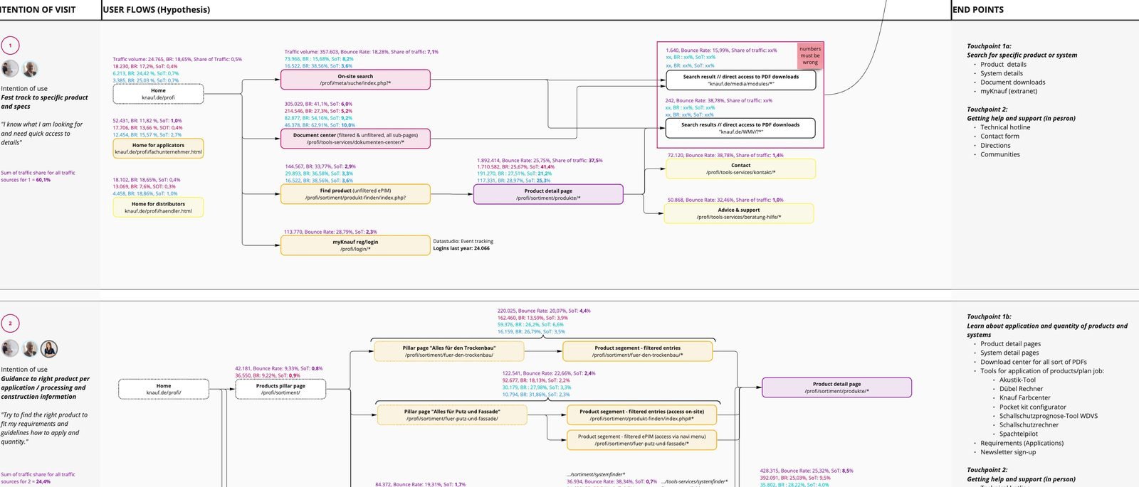
We validated the hypotheses in a small round of interviews — six users, two per group — walking through the proposed journeys. They pushed us further than expected: make global search show results by content category, expose more content to logged-out users, and keep Knauf’s three sub-brands distinguishable instead of merging them into one giant sub-navigation.
Goals
What users needed, what the business needed
Find the right product in three clicks — from search, from the homepage, or from a regional site.
Increase product-page traffic and conversion on a business that relies on organic search.
Always know where you are, especially on mobile — and be able to go back one level.
Reduce drop-off and the support requests that come from people who could not find things.
Get one coherent Knauf experience whichever region or sub-brand you land on.
Stop paying for the same component to be designed and built 12 times.
Chapter 1 · Navigation
Two concepts, twenty users, one clear winner
We clustered every page type by which customer groups need it, voted on where each belongs — hierarchical, global or regional navigation — and benchmarked other industrial-materials companies. Their sites were just as complex, which made us more confident in separating customer journeys rather than flattening everything into one menu.
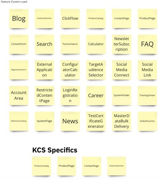
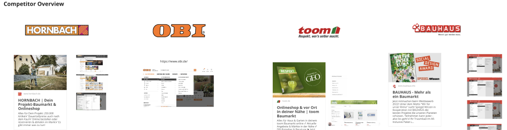
That produced two sitemaps — one for logged-out visitors and one that adapts by customer type after login — and two navigation concepts to test:
Option A · Minimum viable navigation
- Three main topics only: Products & Systems, Tools & Support, Brands
- Breadcrumb keeps you located while browsing
- Trade-off: the mega-menu appears on hover, so you don’t see every option at once
Option B · A space per topic
- Each cluster of expertise gets its own focused area
- Breadcrumb as well
- Trade-off: the navigation starts acting like a breadcrumb, and we would need an extra level as content grows
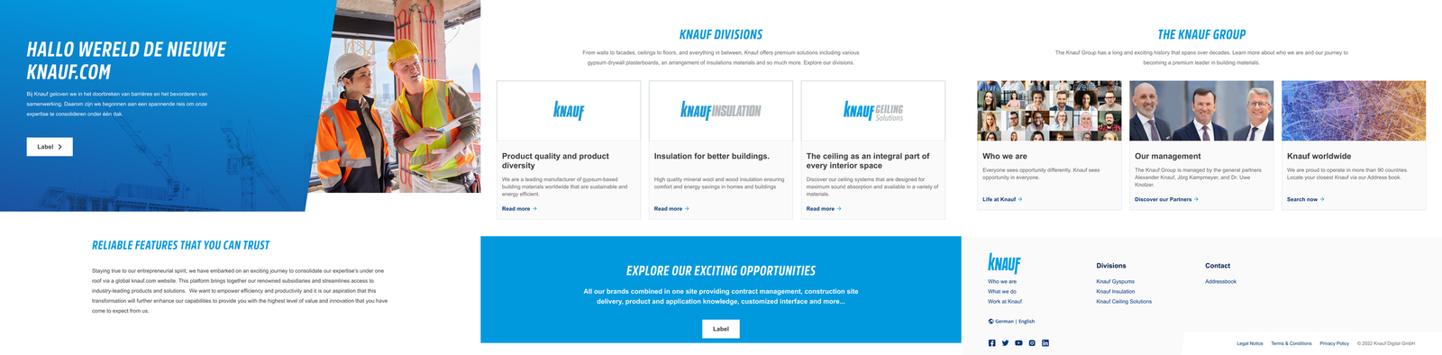
Three pillars and a mega-menu, prototyped across Home, Acoustics, Brands and About.

One dedicated space per topic, tested on the same pages.
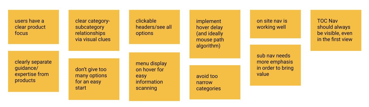
The MVP navigation shipped with the March 2024 relaunch. The breadcrumb turned out to matter most on mobile, where it cut the misleading routes that used to strand people two or three levels deep.
Before — five to six levels between the homepage and a product.
After — one catalogue level with filters, a breadcrumb, and products within three clicks.
What changed
The first month after relaunch
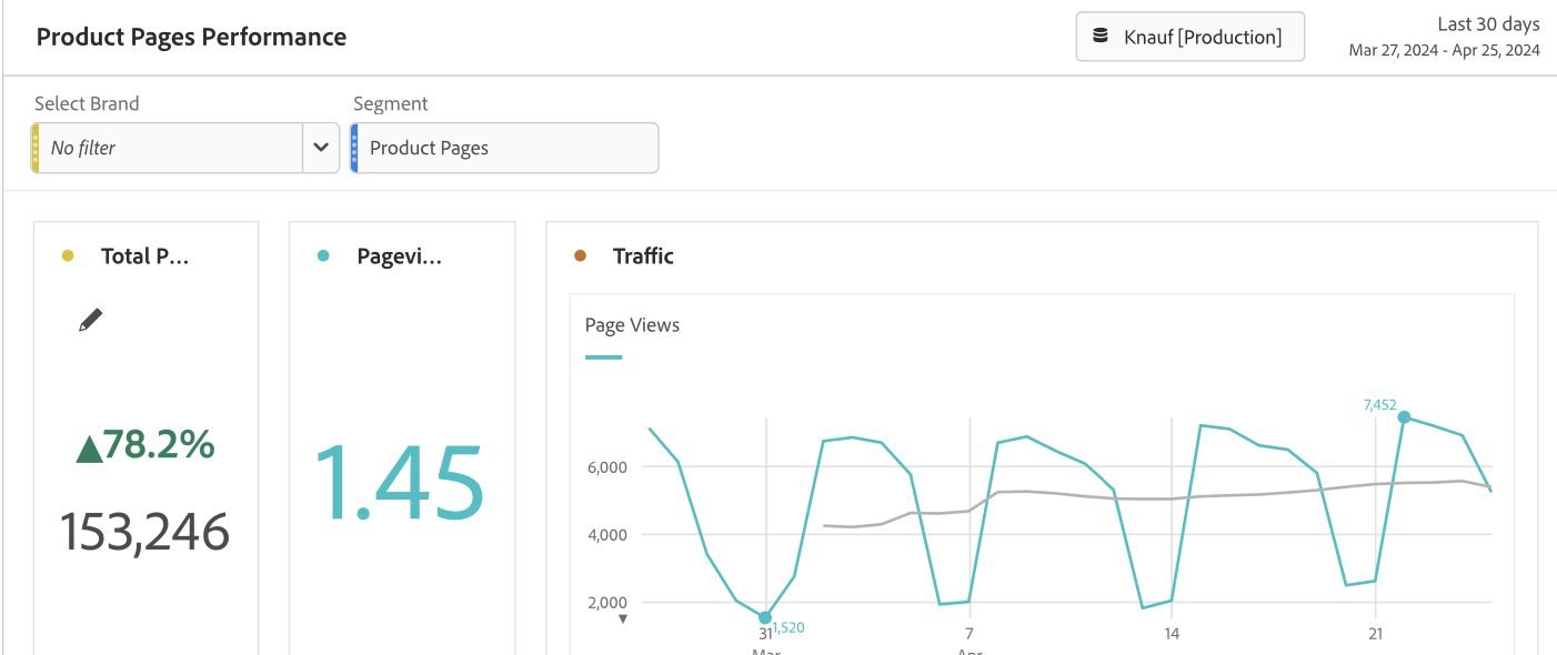
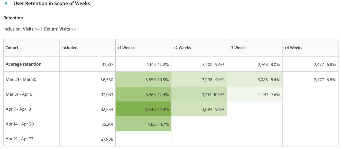
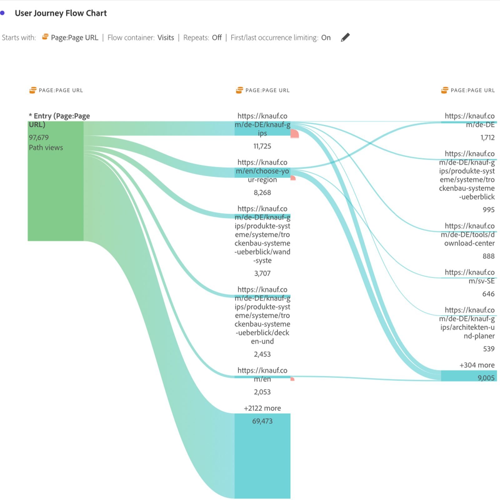
We watched knauf.de closely from the end of March into April 2024. Product-page views were up sharply against the previous period, and the weekly return cohorts stayed healthy — visitors were coming back rather than bouncing off a menu.
Chapter 2 · Design system
Four systems, fifty files, one owner
Role: Product Owner (volunteered)When I joined, Knauf was juggling more than 50 design files and four separate design systems — mobile, web, icons and shared components — similar enough to confuse, different enough to hurt. Nobody owned the whole. I volunteered to be Product Owner for the consolidation and framed the problem from both sides:
Designers
- Rebuilding comparable components across four “dialects” — slow and demotivating
- Changes in one system never propagated to the others
- Design reviews took twice as long; knowledge transfer between teams was poor
Developers
- Two distinct systems to learn, redundant code, harder debugging
- Components could not be reused between platforms
- Web development had fallen behind the native apps; versioning was a constant fight
Six actions, two sprints
1 · Audit. We catalogued every component in use across all files, found the one-offs that had never made it into any system, and cleaned up inconsistent variants.
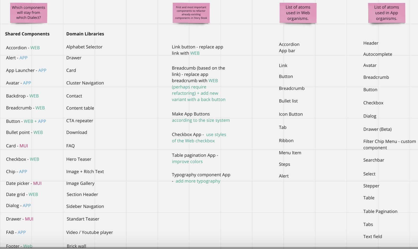
2 · Pick a foundation. Design and front-end chose MUI 5.11 as the base: pre-built, themeable, accessible, and React-native for the developers — which meant our Figma decisions could land in code without a translation layer.
3 · Global first. We evaluated every use case and shaped the components so that 90% live in a global theme with variants for mobile, tablet, desktop and large screens; the special cases went into an organisms file and an icon file.
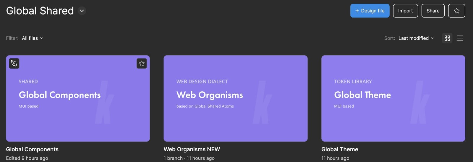
4 · Make Storybook look like the design file. Design debt and development debt had both come from the same gap — nobody could tell what was implemented, or why it looked different. With MUI underneath, developers could update code straight from our files, and both teams could make low-risk changes to the Storybook together.
5 · Swap and test. We replaced old components with new ones on a few screens per application first, ran two rounds of internal user testing on the new grid, shades and spacing, then finished the swap across every application in two sprints.
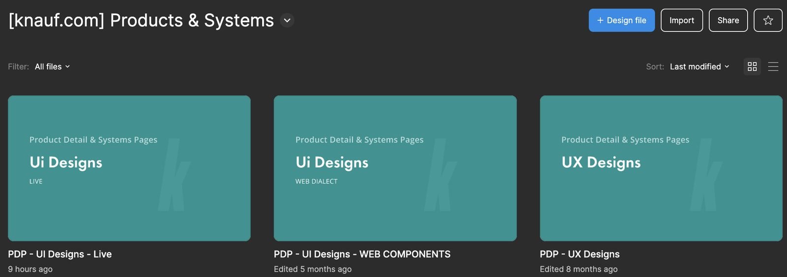
6 · QA together. Design and front-end held a 30-minute daily on one project’s changes and a two-hour weekly refinement on bugs until knauf.com went live.
Outcome
One site, one system, one team
The new knauf.com launched in March 2024 on the consolidated design system. In the first 30 days product-page views on knauf.de rose 78%; weekly retention stayed healthy; and the usability improvements were rolled out across 12 regions and 3 products.
The less measurable outcome mattered as much: the five of us started working like one design team, several front-end developers became Figma converts, and the Storybook update landed on time under real delivery pressure from senior management.
Reflection
What I took with me
Treat one problem, not every pain point
Narrowing and combining research findings was the hardest and most valuable step. An insufficient combination early on would have produced worse problems later; design stayed iterative.
Volunteering for ownership is a design skill
Nobody asked for a design-system PO. Taking the role turned four competing systems into a shared product — and gave me my first hands-on experience with Contentful, MUI and Storybook governance.
Bring developers into the file
The Storybook-parity decision did more for consistency than any component. When engineers love Figma, design debt stops accumulating.
What I’d do differently with AI today
- Cluster the customer-support tickets and 20 interview transcripts with an LLM instead of on sticky walls — the same themes, in an afternoon.
- Prototype Options A and B as clickable code from the MUI theme so tests run on real navigation behaviour, not static screens.
- Generate the responsive variants of the 90% global components from tokens, and spend the saved sprint on the 10% of special cases.
Curious to know more?